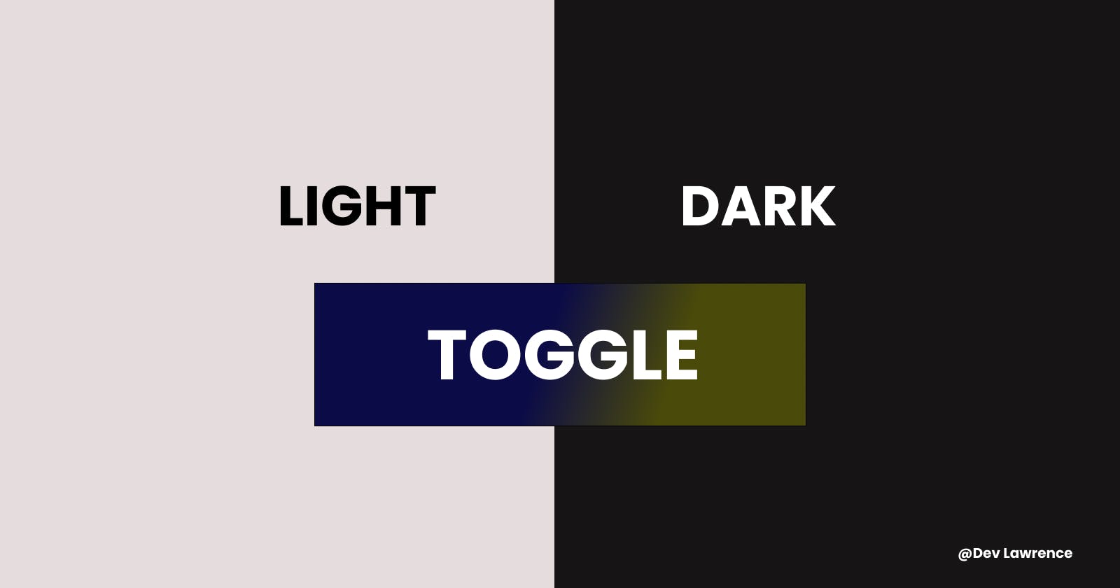


Hey guys 😉, In today’s article, we will build a dark theme toggle with HTML, CSS, and VANILLA JAVASCRIPT. Adding a dark mode toggle button on a website is as popular as ever today, so let’s started 😀.
📼 WHAT IS A TOGGLE
A toggle is a component allowing the user to change a setting between two states. It is like an on/off switch. But in this case, it’s a radio button, but we are going to be hiding it and display a more excellent version of it.
🏗️ THE HTML CODE
In the HTML, we are going to create a div with the class container and inside the container class, we will also create another div with a class of text to wrap some text inside it. Here is the code for more clarity 👇🏽
    <div class="container">
      <div class="text">
        <h1>Dark / Light Theme Toggle</h1>
        <p>
          Lorem ipsum dolor sit amet, consectetur adipisicing elit. Dolorum quo
          possimus nulla vero. Aut atque explicabo aliquid repudiandae. Suscipit
          voluptas, aliquam facere animi a quo tempora impedit nobis pariatur,
          sapiente doloremque atque.
        </p>
      </div>
    </div>
After that, we are also going to create another div with a class of toggle inside the container class.
We are also going to be creating some elements inside the toggle class.
The first element will be an input element that has a type of radio and also has a name attribute called theme and also has an id called light.
The second element will also be an input element as mentioned above. The only thing we will be changing is the id which is now called dark.
The third element will be a span tag with a class of toggle__background
The last element will also be a span tag with a class of toggle__button.
Here is the code for more clarity 👇🏽
      <!-- Toggle -->
      <div class="toggle__wrapper">
        <input type="radio" name="theme" id="light" />
        <input type="radio" name="theme" id="dark" />
        <span class="toggle__background"></span>
        <span class="toggle__button"></span>
      </div>
    </div>
Here is the HTML code in full 👇🏽
<!DOCTYPE html>
<html lang="en">
  <head>
    <meta charset="UTF-8" />
    <meta http-equiv="X-UA-Compatible" content="IE=edge" />
    <meta name="viewport" content="width=device-width, initial-scale=1.0" />
    <title>Darkmode Toggle</title>
    <link rel="stylesheet" href="style.css" />
  </head>
  <body>
    <div class="container">
      <div class="text">
        <h1>Dark / Light Theme Toggle</h1>
        <p>
          Lorem ipsum dolor sit amet, consectetur adipisicing elit. Dolorum quo
          possimus nulla vero. Aut atque explicabo aliquid repudiandae. Suscipit
          voluptas, aliquam facere animi a quo tempora impedit nobis pariatur,
          sapiente doloremque atque.
        </p>
      </div>

      <!-- Toggle -->
      <div class="toggle__wrapper">
        <input type="radio" name="theme" id="light" />
        <input type="radio" name="theme" id="dark" />
        <span class="toggle__background"></span>
        <span class="toggle__button"></span>
      </div>
    </div>

    <script src="app.js"></script>
  </body>
</html>
🏡 THE CSS CODE
In the CSS, we are going to be styling a couple of things. But first, we will be creating some CSS custom properties to store the colors that we are going to use. Custom properties allow a value to be stored in one place, then referenced in multiple other places. You can read more about it here 👇🏽
These are the custom properties we will be creating to store the colors 👇🏽
- A default light color that we will use as the background color in the body.
- A default dark color that we will use as the text color in the body.
- A light color that we will use as the text in the body when we switch to dark mode.
A dark color that we will use as the background color when we switch to dark mode.
Here is the code for more clarity 👇🏽
:root {
  --color-default-light: #e6e6e6;
  --color-default-dark: #000;
  --color-light: #fff;
  --color-dark: #333;

  /* variables to store the default color that will be changed in the dark mode */
  --background: var(--color-default-light);
  --light: var(--color-default-dark);
}
For the body, container, and text class, we will add some basic CSS styles to them 👇🏽
* {
  padding: 0;
  margin: 0;
  box-sizing: border-box;
}

body {
  background-color: var(--background);
  color: var(--light);
  height: 100vh;
}

.container {
  display: flex;
  justify-content: center;
  align-items: center;
  flex-direction: column;
  height: 100%;
}

.text {
  max-width: 700px;
  margin: 0 auto;
  text-align: center;
  margin-bottom: 2rem;
}

.text h1 {
  margin-bottom: 0.5rem;
}
We will also create a class called dark and will are changing the background color and text color to the colors we created in the root. And we are going to add this class in JavaScript later on.
Here is the code for more clarity 👇🏽
body.dark {
  --background: var(--color-dark);
  --light: var(--color-light);
}
Let’s now style the toggle button 😀
Since there are two radio buttons we are going to hide them because will be showing only the toggle button. And we will also add some styles to them 👇🏽
input[type='radio'] {
  margin: 0 -2px 0 -2px;
  opacity: 0;
  width: 30px;
  height: 30px;
  cursor: pointer;
}
Next, we going to add a height and also add a position relative to the toggle wrapper. 👇🏽
.toggle__wrapper {
  position: relative;
  height: 30px;
}
After that, we add the position absolute to the toggle background class relative to the toggle wrapper and a background on it and also remove the pointer events so that it will be on top of the radio buttons and we can still be able to click on the buttons. Here is the code 👇🏽
.toggle__background {
  background-color: #ccc;
  position: absolute;
  width: 100%;
  height: 100%;
  top: 0;
  left: 0;
  border-radius: 30px;
  pointer-events: none;
}
Next, we will create the custom button that will be visible and we will also position it relative to it’s parent element. Here is the code 👇🏽
.toggle__button {
  position: absolute;
  left: 3px;
  top: 2px;
  right: 100%;
  width: 25px;
  height: 25px;
  border-radius: 50%;
  background-color: rebeccapurple;
  transition: all 150ms ease-in-out;
}
Lastly, in CSS, we want the button to move when we click on the radio button with an id of dark. And we can do that using these two selectors 👇🏽
- The :checked selector on the radio input - will tell us whether it is checked or not
- The
~or the sibling selector - will help us target the toggle button which comes after the toggle background class
Here is the code 👇🏽
#dark:checked ~ .toggle__button {
  left: 30px;
}
Here is the CSS CODE in full 👇🏽
@import url('https://fonts.googleapis.com/css2?family=Poppins:wght@400;300;600&display=swap');

* {
  padding: 0;
  margin: 0;
  box-sizing: border-box;
}

:root {
  --color-default-light: #e6e6e6;
  --color-default-dark: #000;
  --color-light: #fff;
  --color-dark: #333;

  /* variables to store the default color that will be changed in the dark mode   */
  --background: var(--color-default-light);
  --light: var(--color-default-dark);
}

body {
  font-family: 'Poppins', sans-serif;
  background-color: var(--background);
  color: var(--light);
  height: 100vh;
}

body.dark {
  --background: var(--color-dark);
  --light: var(--color-light);
}

.container {
  display: flex;
  justify-content: center;
  align-items: center;
  flex-direction: column;
  height: 100%;
}

.text {
  max-width: 700px;
  margin: 0 auto;
  text-align: center;
  margin-bottom: 2rem;
}

.text h1 {
  margin-bottom: 0.5rem;
}

input[type='radio'] {
  margin: 0 -2px 0 -2px;
  opacity: 0;
  width: 30px;
  height: 30px;
  cursor: pointer;
}

.toggle__wrapper {
  position: relative;
  height: 30px;
}
.toggle__background {
  background-color: #ccc;
  position: absolute;
  width: 100%;
  height: 100%;
  top: 0;
  left: 0;
  border-radius: 30px;
  pointer-events: none;
}
.toggle__button {
  position: absolute;
  left: 3px;
  top: 2px;
  right: 100%;
  width: 25px;
  height: 25px;
  border-radius: 50%;
  background-color: rebeccapurple;
  transition: all 150ms ease-in-out;
}

#dark:checked ~ .toggle__button {
  left: 30px;
}
🔧 THE JAVASCRIPT CODE
The JavaScript is not really complicated at all.
First, we will bring the elements we need from the DOM (document object model) and store them in a variable.
const darkButton = document.querySelector('#dark');
const radioButtons = document.querySelectorAll('.toggle__wrapper input');
Next, we will create two arrow functions.
Inside the first function, we enable the dark class we created in the CSS earlier on and in the second function, we remove the dark class
Here is the code for more clarity.
const enableDarkMode = () => {
  document.body.classList = 'dark';
};

const disableDarkMode = () => {
  document.body.classList = '';
};
Next, we will add an event listener to each radio button using the forEach loop
And inside the button, we will create a callback function and also create an if statement to check if the dark button is checked. And if the dark button is checked then enable dark mode. Otherwise, disable dark mode.
Here is the code for more clarity 👇🏽
radioButtons.forEach((button) => {
  button.addEventListener('click', () => {
    if (darkButton.checked) {
      enableDarkMode();
    } else {
      disableDarkMode();
    }
  });
});
Here is the JAVASCRIPT CODE IN FULL 👇🏽
const darkButton = document.querySelector('#dark');
const radioButtons = document.querySelectorAll('.toggle__wrapper input');

const enableDarkMode = () => {
  document.body.classList = 'dark';
};

const disableDarkMode = () => {
  document.body.classList = '';
};

radioButtons.forEach((button) => {
  button.addEventListener('click', () => {
    if (darkButton.checked) {
      enableDarkMode();
    } else {
      disableDarkMode();
    }
  });
});
Here is also a link to the code pen 👇🏽
codepen.io/lawrence-stixx/pen/yLjBWLP
CONCLUSION
That’s all guys. Hope you learned something from this article. See you next time😀.