How to Build an Accordion Menu
Build this accordion menu with very few lines of JavaScript code


Hey there my friends 😀, Have you ever wondered how to create an accordion menu for your website? A well-designed accordion menu can simplify your site's navigation and provide a better user experience. In this article, we'll walk you through the process of creating an accordion menu step by step, so you can improve your website's functionality and help your visitors quickly find the content they need. Let’s dive right into it 😉
🧰 Prerequisite
Basic knowledge of HTML and CSS.
Fundamental knowledge of JavaScript (I will still explain everything).
What is an Accordion Menu?
An accordion menu is a type of user interface element commonly used in websites and applications to help users navigate content. It is mainly implemented in the FAQ (Frequently Asked Question) section of a website. It typically consists of a list of clickable headers, with each header revealing additional content when clicked. The content is often hidden by default and expands or collapses like the bellows of an accordion when the user interacts with it. The accordion menu allows for more efficient use of screen space by hiding content until it is needed. It also provides a clear and organized way for users to interact with the content.
Let's write some code now that you have a basic knowledge of what an accordion is.
🏚️ HTML CODE
For the HTML code, we are going to be creating a container div with the class accordion-container which is going to be the parent container and several child divswith the class accordion. Each accordion div will contain two child divs - one with the class title and one with the class content.
The title div will contain a heading element h3 with a question related to the content that will be revealed. When the user clicks on the heading, the content div underneath it will be revealed. The content div will contain a paragraph element p with information related to the question posed in the title div.
Here is what the code looks like 👇🏽
<body>
<div class="accordion-container">
<div class="accordion">
<div class="title">
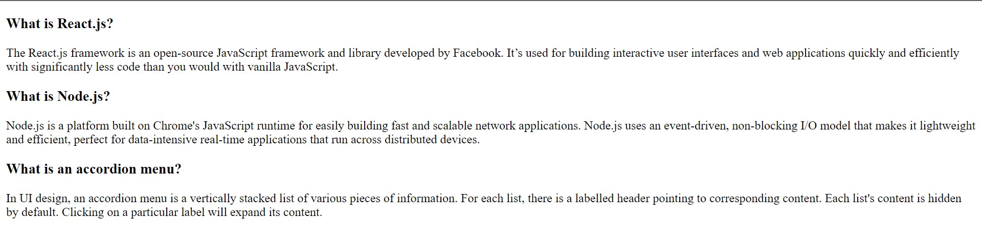
<h3>What is React.js?</h3>
</div>
<div class="content">
<p>
The React.js framework is an open-source JavaScript framework and
library developed by Facebook. It’s used for building interactive
user interfaces and web applications quickly and efficiently with
significantly less code than you would with vanilla JavaScript.
</p>
</div>
</div>
<div class="accordion">
<div class="title">
<h3>What is Node.js?</h3>
</div>
<div class="content">
<p>
Node.js is a platform built on Chrome's JavaScript runtime for
easily building fast and scalable network applications. Node.js uses
an event-driven, non-blocking I/O model that makes it lightweight
and efficient, perfect for data-intensive real-time applications
that run across distributed devices.
</p>
</div>
</div>
<div class="accordion">
<div class="title">
<h3>What is an accordion menu?</h3>
</div>
<div class="content">
<p>
In UI design, an accordion menu is a vertically stacked list of
various pieces of information. For each list, there is a labelled
header pointing to corresponding content. Each list's content is
hidden by default. Clicking on a particular label will expand its
content.
</p>
</div>
</div>
</div>
<script src="main.js"></script>
</body>
</html>
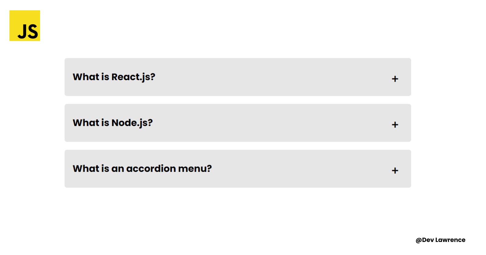
So far this is what we have in our browser 👇🏽
Ugly right? 😅
So let’s make it look more appealing by adding some CSS styles 👇🏽
🏡 CSS CODE
We are going to be breaking down the CSS code into blocks for easier understanding 👇🏽
The first block of CSS code will style the container of the accordion menu. It sets the padding, height, display, align-items, justify-content, and flex-direction properties to position and centers the accordion menu within the container.
The second block of CSS code styles the individual accordion items. It sets the background color, margin, padding, border-radius, max-width, and width properties to create the visual appearance of each accordion item.
The third block of CSS code styles the title of each accordion item. It sets the position property to position the title within the item, and the content property to add a plus sign (+) before the title. It also sets the font-size, transition, and cursor properties to create the interactive behavior of the accordion.
The fourth block of CSS code styles the heading (h3) of each accordion item. It sets the font-size and font-weight properties to style the heading.
The fifth block of CSS code styles the content of each accordion item. It sets the color, max-height, and overflow properties to hide the content of each item. It also sets the transition property to create the animation when the content is expanded.
The sixth block of CSS code styles the content of each accordion item when it is active or expanded. It sets the padding-top, height, and max-height properties to show the content of each item. It also sets the transition property to create the animation when the content is expanded.
The seventh block of CSS code styles the title of each accordion item when it is active or expanded. It sets the content property to change the plus sign (+) to a minus sign (-) when the item is expanded.
Here is the output of all that we just explained 👇🏽
.accordion-container {
  padding: 5rem 1rem;
  height: 100vh;
  display: flex;
  align-items: center;
  justify-content: center;
  flex-direction: column;
}

.accordion {
  background-color: #e6e6e6;
  margin-bottom: 1rem;
  padding: 1.5rem 1rem;
  border-radius: 0.3rem;
  max-width: 700px;
  margin-inline: auto;
  width: 100%;
}

.title {
  position: relative;
}

.title::before {
  content: '+';
  position: absolute;
  right: 0.5rem;
  font-size: 1.5rem;
  transition: all 0.4s cubic-bezier(1, 0, 1, 0);
  cursor: pointer;
}

h3 {
  font-size: 1.2rem;
  font-weight: 700;
}

.content {
  color: black;
  max-height: 0;
  overflow: hidden;
  transition: all 0.2s cubic-bezier(0, 1, 0, 1);
}

.accordion.active .content {
  padding-top: 1rem;
  height: auto;
  max-height: 999px;
  transition: all 0.2s cubic-bezier(1, 0, 1, 0);
}

.accordion.active .title::before {
  content: '-';
}
Now let’s see how it looks on our browser after adding the CSS styles 👇🏽
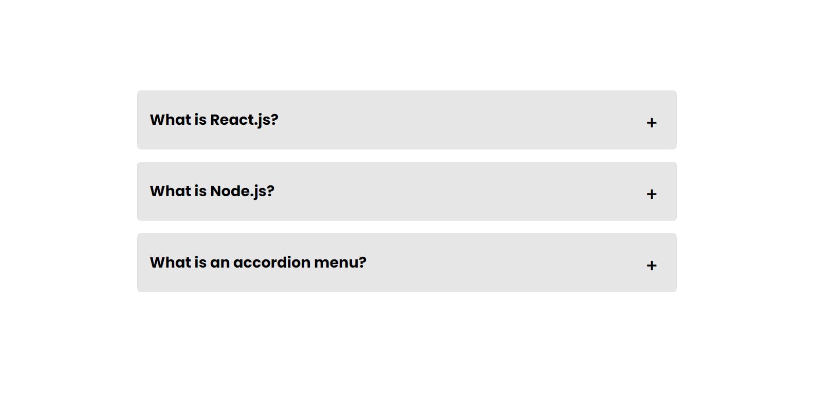
Looks more appealing now right? Let’s make it interactive 🙂
🏗️ JAVASCRIPT CODE
This JavaScript code is responsible for adding interactivity to the accordion menu that was created using the HTML and CSS code. Let’s see how the code looks before we explain what each line does 👇🏽
const accordions = document.querySelectorAll('.accordion');
const content = document.querySelector('.content');

accordions.forEach((accordion) => {
  accordion.addEventListener('click', () => {
    accordion.classList.toggle('active');
  });
});
The first line of code selects all elements with the class name "accordion" using the querySelectorAll method and assigns them to the accordions variable.
The second line selects the first element with the class name "content" using the querySelector method and assigns it to the content variable.
The third line uses the forEach method to loop through each element in the accordions array and adds a click event listener to each one. When a user clicks on an accordion element, the callback function inside the event listener is executed.
This callback function toggles the "active" class on the clicked accordion element using the classList.toggle method. When an accordion element has the "active" class, its corresponding content element is displayed by setting its max-height property to a large value. When the "active" class is removed, the content element is hidden again by setting its max-height property to 0. This behavior is achieved by the CSS code provided in the HTML file.
CONCLUSION
Congrats on getting to the end of this article 🎉. Hope you learned something from this article. You can get the code for this project from Codepen. Till next time 🙂