Creating an Image Expand Gallery

I try my best to teach technical web development concepts in an easier and more fun way.
✋🏽 Introduction
Hey guys, In this tutorial, we'll walk through the process of creating a responsive image expand gallery using HTML, CSS, and JavaScript. This gallery allows users to click on thumbnail images, triggering an expansion effect to showcase the selected image in greater detail. We'll cover the HTML structure, CSS styling, and JavaScript functionality, providing a comprehensive guide for both beginners and those looking to enhance their web development skills. Let’s dive right in 😉
🧰 Prerequisites
To follow along with this tutorial, you should have a basic understanding of HTML, CSS, and JavaScript(I’ll still explain everything in depth though). You should also have a code editor installed on your computer, such as Visual Studio Code or any other text editor that you use.
🏚️ HTML CODE 👇🏽
Let’s start creating an image container (div with the class "image-container") and individual image div with the class imagewithin it. The image class will also have two elements which is the individual img element and a span element with some text and emojis
<div class="image-container">
      <div class="image active">
        <img
          src="<https://images.unsplash.com/photo-1472214103451-9374bd1c798e?q=80&w=2070&auto=format&fit=crop&ixlib=rb-4.0.3&ixid=M3wxMjA3fDB8MHxwaG90by1wYWdlfHx8fGVufDB8fHx8fA%3D%3D>"
          alt="nature"
          title="nature"
        />

        <span> Nature ☘ </span>
      </div>

      <div class="image">
        <img
          src="<https://images.unsplash.com/photo-1511593358241-7eea1f3c84e5?q=80&w=1974&auto=format&fit=crop&ixlib=rb-4.0.3&ixid=M3wxMjA3fDB8MHxwaG90by1wYWdlfHx8fGVufDB8fHx8fA%3D%3D>"
          alt="water"
          title="water"
        />

        <span>Ocean 💦</span>
      </div>

      <div class="image">
        <img
          src="<https://images.unsplash.com/photo-1531884070720-875c7622d4c6?q=80&w=2071&auto=format&fit=crop&ixlib=rb-4.0.3&ixid=M3wxMjA3fDB8MHxwaG90by1wYWdlfHx8fGVufDB8fHx8fA%3D%3D>"
          alt="eagle"
          title="eagle"
        />
        <span>Eagle 🦅</span>
      </div>

      <div class="image">
        <img
          src="<https://images.unsplash.com/photo-1504754524776-8f4f37790ca0?q=80&w=2070&auto=format&fit=crop&ixlib=rb-4.0.3&ixid=M3wxMjA3fDB8MHxwaG90by1wYWdlfHx8fGVufDB8fHx8fA%3D%3D>"
          alt="food"
          title="food"
        />

        <span>Food 🥘</span>
      </div>
      <div class="image">
        <img
          src="<https://images.unsplash.com/photo-1553440569-bcc63803a83d?q=80&w=2025&auto=format&fit=crop&ixlib=rb-4.0.3&ixid=M3wxMjA3fDB8MHxwaG90by1wYWdlfHx8fGVufDB8fHx8fA%3D%3D>"
          alt="car"
          title="car"
        />

        <span>Car 🚗</span>
      </div>
    </div>
The active class you are seeing is what we are going to use to track the current image we are on so that it can be expanded. But we’ll see it in action in a bit.
Here is the HTML code in full 👇🏽
<!DOCTYPE html>
<html lang="en">
  <head>
    <meta charset="UTF-8" />
    <meta name="viewport" content="width=device-width, initial-scale=1.0" />
    <title>Image expand gallery</title>
    <link rel="stylesheet" href="style.css" />
  </head>
  <body>
    <div class="image-container">
      <div class="image active">
        <img
          src="<https://images.unsplash.com/photo-1472214103451-9374bd1c798e?q=80&w=2070&auto=format&fit=crop&ixlib=rb-4.0.3&ixid=M3wxMjA3fDB8MHxwaG90by1wYWdlfHx8fGVufDB8fHx8fA%3D%3D>"
          alt="nature"
          title="nature"
        />

        <span> Nature ☘ </span>
      </div>

      <div class="image">
        <img
          src="<https://images.unsplash.com/photo-1511593358241-7eea1f3c84e5?q=80&w=1974&auto=format&fit=crop&ixlib=rb-4.0.3&ixid=M3wxMjA3fDB8MHxwaG90by1wYWdlfHx8fGVufDB8fHx8fA%3D%3D>"
          alt="water"
          title="water"
        />

        <span>Ocean 💦</span>
      </div>

      <div class="image">
        <img
          src="<https://images.unsplash.com/photo-1531884070720-875c7622d4c6?q=80&w=2071&auto=format&fit=crop&ixlib=rb-4.0.3&ixid=M3wxMjA3fDB8MHxwaG90by1wYWdlfHx8fGVufDB8fHx8fA%3D%3D>"
          alt="eagle"
          title="eagle"
        />
        <span>Eagle 🦅</span>
      </div>

      <div class="image">
        <img
          src="<https://images.unsplash.com/photo-1504754524776-8f4f37790ca0?q=80&w=2070&auto=format&fit=crop&ixlib=rb-4.0.3&ixid=M3wxMjA3fDB8MHxwaG90by1wYWdlfHx8fGVufDB8fHx8fA%3D%3D>"
          alt="food"
          title="food"
        />

        <span>Food 🥘</span>
      </div>
      <div class="image">
        <img
          src="<https://images.unsplash.com/photo-1553440569-bcc63803a83d?q=80&w=2025&auto=format&fit=crop&ixlib=rb-4.0.3&ixid=M3wxMjA3fDB8MHxwaG90by1wYWdlfHx8fGVufDB8fHx8fA%3D%3D>"
          alt="car"
          title="car"
        />

        <span>Car 🚗</span>
      </div>
    </div>

    <script src="script.js"></script>
  </body>
</html>
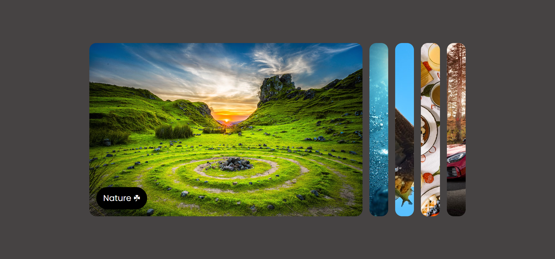
Here is the output so far 👇🏽

You can see that the images are just all over the place. so let’s add some styling to it.
🏡 CSS CODE
The CSS style looks a bit lengthy, But we are going to break it down into different parts for easier understanding.
First, we are going to add a CSS reset, ensuring consistent box model behavior by zeroing out margins and padding for all elements.
* {
  margin: 0;
  padding: 0;
  box-sizing: border-box;
}
After that, we are now going to style all img elements, setting their maximum width to 100%, adding a border-radius of 1rem (rounded corners), and setting a pointer cursor. 👇🏽
img {
  max-width: 100%;
  border-radius: 1rem;
  cursor: pointer;
}
Now were are going to style the body element by centering the content both horizontally and vertically using grid, set the body's height to 100vh and width to 100% of the viewport, hide overflow, and sets a background color. 👇🏽
body {
  display: grid;
  place-items: center;
  height: 100vh;
  width: 100%;
  overflow: hidden;
  background-color: #464343;
}
Next, we’ll be styling the image-container (div with class .image-container). We’ll use Flexbox to display its children in a row with a 1rem gap. We are also going to set a maximum width of 900px, a width of 100% minus 100px, centering it in the middle using auto margin, and padding. We’ll also set the overflow to hidden. 👇🏽
.image-container {
  display: flex;
  gap: 1rem;
  max-width: 900px;
  width: calc(100% - 100px);
  margin-inline: auto;
  padding: 0 1rem;
  overflow: hidden;
}
Next, we’ll be styling the image class that is within the image-container. We’ll give it a position of relative because we’ll be setting the position of the span element to absolute, give it a fixed width and height, add some rounded corners, and a transition effect using cubic-bezier timing function. 👇🏽
.image-container .image {
  position: relative;
  width: 60px;
  height: 400px;
  border-radius: 1rem;
  overflow: hidden;
  transition: 0.5s cubic-bezier(0.05, 0.61, 0.41, 0.95);
}
Next, we’ll be styling the img elements within the image container. We’ll give it a width and height of 100% to inherit the width and height of the parent container which is the image container, we’ll also use object-fit: cover to maintain aspect ratio while covering the entire container, and have a transition effect. 👇🏽
.image-container .image img {
  width: 100%;
  height: 100%;
  object-fit: cover;
  transition: 0.5s cubic-bezier(0.05, 0.61, 0.41, 0.95);
}
Next, we’ll be styling the span element. we’ll first of all set to inline-block, positioned absolute with a background color, padding, rounded corners, text color, font size, and initial scale set to 0. we’ll also give it a transition effect with a delay so that the image will expand fully before the text will pop up. 👇🏽
span {
  display: inline-block;
  position: absolute;
  left: 1rem;
  bottom: 1rem;
  background-color: #000;
  padding: 0.7rem 1rem;
  border-radius: 100vw;
  color: #fff;
  font-size: 1.2rem;
  transform: scale(0);
  transition: 0.5s cubic-bezier(0.05, 0.61, 0.41, 0.95) 0.3s;
}
Next will be the style for the active state of the image container. When an image is active, it takes up 100% width, and the span inside it scales to 1. 👇🏽
.image-container .active {
  width: 100%;
}

.image-container .active span {
  transform: scale(1);
}
Lastly for the CSS, we’ll be adding media query for smaller screens and below so that the images can stack from top to bottom(horizontally) instead of vertically which is the default. So, we’ll change the flex direction, adjusts the max-width and height of the image container, modify the height of images and active state accordingly. 👇🏽
@media (max-width: 576px) {
  /* Styles for screens with a maximum width of 576px */
  .image-container {
    flex-direction: column;
    max-width: 2000px;
    width: 100%;
    height: 400px;
  }

  .image-container .image {
    width: 100%;
    height: 60px;
    transition: height 0.5s ease-in-out;
  }

  .image-container .active {
    height: 400px;
  }
}
Here is the CSS code in full 👇🏽
@import url('<https://fonts.googleapis.com/css2?family=Poppins:wght@300;400;500;600;700>');

* {
  margin: 0;
  padding: 0;
  box-sizing: border-box;
}

img {
  max-width: 100%;
  border-radius: 1rem;
  cursor: pointer;
}

body {
  font-family: 'Poppins', sans-serif;
  display: grid;
  place-items: center;
  height: 100vh;
  width: 100%;
  overflow: hidden;
  background-color: #464343;
}

.image-container {
  display: flex;
  gap: 1rem;
  max-width: 900px;
  width: calc(100% - 100px);
  margin-inline: auto;
  padding: 0 1rem;
  overflow: hidden;
}

.image-container .image {
  position: relative;
  width: 60px;
  height: 400px;
  border-radius: 1rem;
  overflow: hidden;
  transition: 0.5s cubic-bezier(0.05, 0.61, 0.41, 0.95);
}

.image-container .image img {
  width: 100%;
  height: 100%;
  object-fit: cover;
  transition: 0.5s cubic-bezier(0.05, 0.61, 0.41, 0.95);
}

span {
  display: inline-block;
  position: absolute;
  left: 1rem;
  bottom: 1rem;
  background-color: #000;
  padding: 0.7rem 1rem;
  border-radius: 100vw;
  color: #fff;
  font-size: 1.2rem;
  transform: scale(0);
  transition: 0.5s cubic-bezier(0.05, 0.61, 0.41, 0.95) 0.3s;
}

.image-container .active {
  width: 100%;
}

.image-container .active span {
  transform: scale(1);
}

@media (max-width: 576px) {
  .image-container {
    flex-direction: column;
    max-width: 2000px;
    width: 100%;
    height: 400px;
  }

  .image-container .image {
    width: 100%;
    height: 60px;
    transition: height 0.5s ease-in-out;
  }

  .image-container .image img {
    width: 100%;
    height: 100%;
  }

  .image-container .active {
    height: 400px;
  }
}
Here is the output of HTML and CSS code so far 👇🏽
🏗️ JAVASCRIPT CODE
The JavaScript code will be very minimal because the main work is in the CSS which we’ve already tackled. It’s basically just 14 lines of code. So let’s break it down 👇🏽
We’ll first of all select all elements with the class 'image' using document.querySelectorAll and store it in a variable called images, thereby creating a NodeList of all matching elements. 👇🏽
const images = document.querySelectorAll('.image');
Next, we’ll create a function called expandImage which will be responsible for handling the expansion logic. and we’ll iterate through each element in the images NodeList using forEach. For each image and also add a click event listener.
const expandImage = () => {
  images.forEach((image) => {
    image.addEventListener('click', () => {
      const active = document.querySelector('.active');
      active.classList.remove('active');

      image.classList.add('active');
    });
  });
};
Upon clicking an image, the function does the following:
Finds the currently active image using
document.querySelector('.active')and stores it in the variableactive.Removes the 'active' class from the currently active image using
active.classList.remove('active').Adds the 'active' class to the clicked image using
image.classList.add('active'), making it the new active image.
And lastly, we are just going to invoke the function 👇🏽
expandImage();
Here is the JavaScript code in full 👇🏽
const images = document.querySelectorAll('.image');

const expandImage = () => {
  images.forEach((image) => {
    image.addEventListener('click', () => {
      const active = document.querySelector('.active');
      active.classList.remove('active');

      image.classList.add('active');
    });
  });
};

expandImage();
CONCLUSION
That’s it guys. Hope you learned something from this article. You can get the code or see it in action from my Codepen and feel free to play around with the code and even come up with something better. Till next time 🙂


